|
1. Does Aaron Draplin inspire you?
Yes, he does inspire me. Not only did he work his way from the bottom, he never changed his mindset and could even laugh about his mistakes than being bitter and regretful. 2. What are 3 things you learned about design from this class? a. I learned the elements of art and principles of design are essential to think back on to create a cohesive design. b. A designer ends up working for their client's wants and needs even if the designer believes a different design or idea is better. c. I learned that design is always a back-and-forth process between yourself because the way you think about your own design changes, and sometimes you need to take a step back and learn when to accept the flaws. 3. How will you continue to use design in your life after this class? Even after leaving this class, I'll notice the designs, colors, and typographies that companies use to represent themselves. I'll notice kerning mistakes and spacing issues and even comment on ways that the design draws away from the original purpose. I'll think back on the elements of art and principles of design when I create something to make sure I am highlighting the important and creating a nice flow between the elements.
0 Comments
1. What makes a good story?
A good story is one that is simple and easy to understand while evoking emotions and catching attention. The key point is to have a plotline that appeals to the audience while making sure that every aspect is easy to see. 2. a) Divert focus from the product and toward the more ‘human’ part of the project. b) Keep the story simple and short. Don’t add too much. 1. How can you design for simplicity?
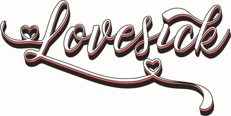
By focusing on the basics and not overcrowding a design, I can prioritize simplicity. If I take a second look at my design I can cut out extra elements that I would have overlooked. 2. Why is simple sometimes better? Basics allow for people to understand the design better and be more memorable. Complexity can scare people and overwhelm them.  This is a side project that I took up by myself using a tutorial online. The project used a lot of opacity options such as color dodge and screen that I haven't used a lot before. There were also a lot of clipping masks that were used. New concepts such as copying and pasting a larger or smaller version of what was on the clipboard also was a fun experience to learn and the different gradients/opacities made for a fun look overall. It was a bit difficult, but very fun and educational. I would definitely do it again.
1. What does Marian Bantjes call herself or state as her profession?
She calls herself a graphic artist whose work doesn't follow aesthetic or popular design but her own interests and wishes. 2. Do you like her work? Why or why not? I do not particularly like her work as it seems busy to me, but it is very innovative and gains attention by getting viewers to think about her work. Although it isn't aesthetically appealing to me, her work is very smart and creative.  I really like the top design because I feel that the creator used the shape of a gecko really well and the letters emphasize the effect of what a calligram is supposed to give. The word and the image compliment each other without one overshadowing the other.
If there was something I had to change I think I would have made the 'c' in the second word a bit smaller. I think that it's a bit big and out of place with the others. Or maybe all of the letters could have been made capitals. |
AuthorMy name is Jenny Cho and Archives
May 2019
Categories |


 RSS Feed
